Round Pegs – Sara Health Assistant
2017
Background
DASA is the largest medical diagnostic company in Latin America and the fifth-largest in the world, with 321 branches across Brazil catering for 55,000 patients daily and processing more than 10 million tests each month (source). Sara Health Assistant was the first project of Round Pegs innovation consultant agency for Dasa. Sara’s concept was developed after market and users’ research, and the MVP was shaped during a design sprint.
Challenges
When a patient needs to schedule medical diagnostic exams in Brazil, usually they call a lab and need to tell all the information to an attendant. It is a painful and tricky task, as the exams have complicated names and different procedures. Above all, the patient wants to schedule all of them on the same day, at closer hours. And at the end of this process, the patient needs a health insurance answer, communicating if the exams are covered.
It’s a stressful process, and mistakes are pretty common.
Goals
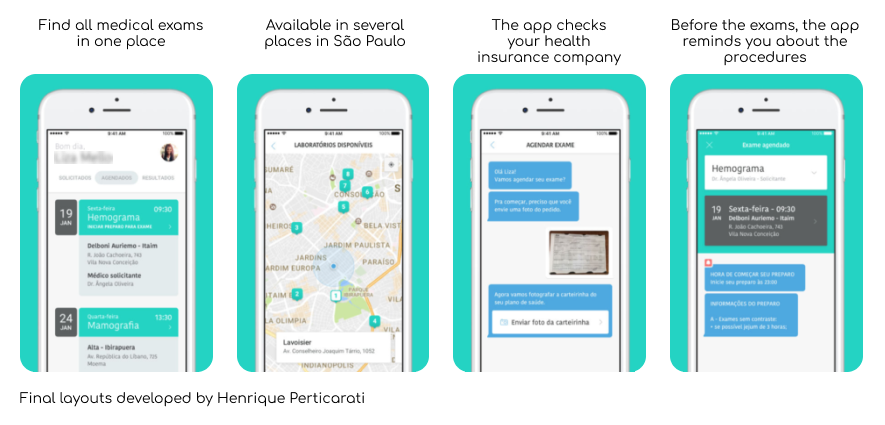
Designing an app where patients could schedule their exams, send their information and choose the best days and hours in a friendly and easy way. Accessible for different levels of tech-savvy people.
Work process
1. Concept proof
The process started with a design sprint, where the pain points were mapped, and solutions were prototyped and tested.
Following the design sprint, we developed a complete prototype. We performed research in diagnosis service centres, interviewing patients and lab professionals. With the collected data, we improved the interface and resources.
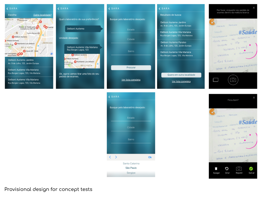
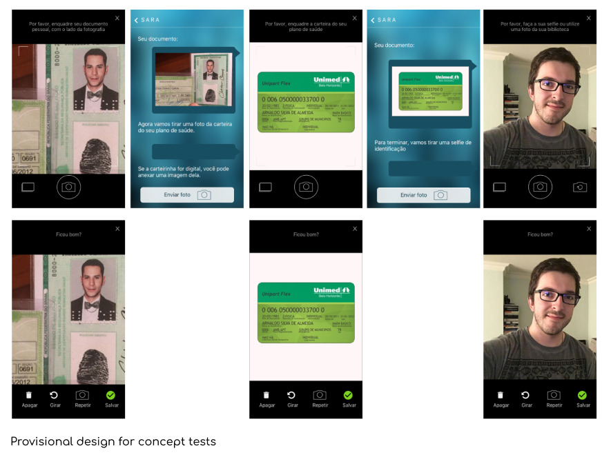
Before developing the final interfaces and features, we tested mockups with a provisional design created during the design sprint. More than visuals, the proposal was to test the app concept.
2. MVP development
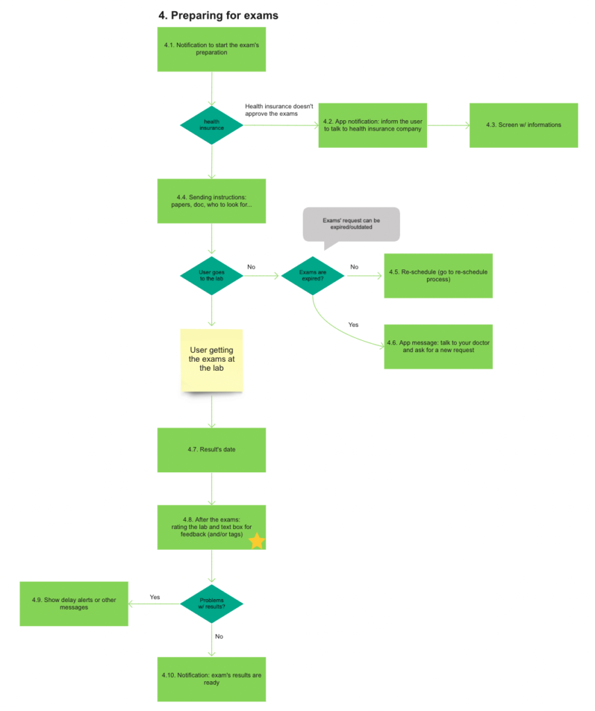
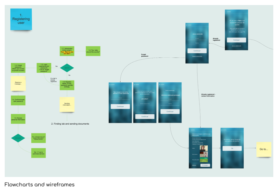
The app was developed with a remote team, with team members from 4 different countries. While working remotely, I created a series of flowcharts on Miro to make the flows more self-explanatory. The platform also allows the team members to discuss, raise questions, and suggest new ideas.
My role
Design, prototyping, and interview users.
Outcomes
One of the most relevant learnings was understanding the variety of potential users. People less tech-savvy or elderly are a large part of the diagnosis services. They could benefit from a service like the proposed app, but only if it was well-fitted for them.
Another practical aspect was that, more than the app, the project demanded a deeper review of service flows to coordinate the proposed tasks of scheduling the various exams.
